This Sage People release introduces a new look for the WX homepage and service pages. We've introduced new homepage components as shown below.
-
A new carousel component for internal communications
-
A new community updates section for carousel summary processes. Count summaries display above this section
You can control these changes to the homepage and service pages by a new setting on the HCM Configure page. Or by a policy setting.
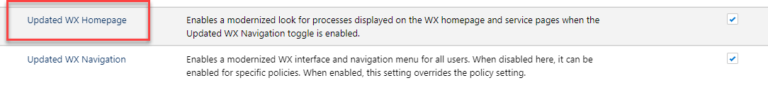
Enable the new homepage
Enable the new WX homepage widgets using the Updated WX Homepage setting at either the organization or policy level. This setting enables a modernized look for processes you display on the homepage and service pages. This only applies to users of the updated WX, when you enable the Updated WX Navigation setting for the organization or by policy.
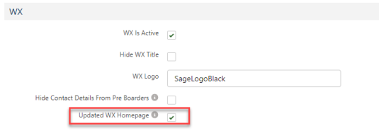
Organization-level setting
Enable the new look WX homepage and service page for all users in the organization:
-
Go to Setup and select Apps.
-
Click Packaging, then Installed Packages, and select Configure.
-
Select the Updated WX Homepage option.
-
Select Save. This enables the new homepage and service page for all users of the updated WX navigation.
Policy-level setting
Enable the new WX homepage layout for users in a specific policy:
-
In the HR Manager portal, open the Policies tab.
-
Select the policy you want to edit.
-
Select Edit.
-
In the WX section, select Updated WX Homepage.
-
Select Save.
Enabling the setting at the policy level means that the updated homepage layout is available to users in this policy. This is regardless of whether you enable or disable it at the organization level. If the organization-level setting is off, you can enable it here for users in this policy. For this setting to take effect, you must enable the Updated WX Navigation setting, either at the organization or policy level.
Internal communications carousel
We've added a new carousel component to display Internal Communication processes on the WX homepage and service pages. This component groups all Internal Communications into a new section at the top of the page. It has a configurable title and subtitle.

You can add up to 20 internal communications to the page. Depending on the screen size, the first few tiles will display by default. Users can display other tiles using the arrows or breadcrumbs to scroll the list. We suggest keeping the number of internal communications in your carousel to 7-10 items.
You control the title and subtitle by new fields Service Page Title and Service Page Subtitle on the WX Service page layout. See New fields on the WX Service page layout.
Supported tile types
We still support all Internal Communication detail page types for use with the new carousel. However, we only support the following Internal Communication tile types for use with the new carousel:
-
Image
-
Image Click Through
-
YouTube
-
Video
-
Twitter
Detail pages no longer show for Image Click Through tiles.
On 30 June 2023, X (formerly Twitter) changed its terms of use for third-party access. Some customers experience issues with embedded timelines when using the Twitter Internal Communication type. X feeds can load differently than you expect, and a message stating "Nothing to see here" sometimes displays.
We don't support the following tile types and we'll remove them in a future release:
-
Rich Text
-
External Website
-
HTML
-
KYP Game
We're making these changes to improve the look and consistency of the WX portal when you use the new homepage carousel. We recommend that if you have Internal Communications that use one of these unsupported tile types, you convert them to a supported tile type.
Migrating to supported tile types
To convert your existing tiles to a supported type, edit the Internal Communication. Set the Tile Type to one of the types we support. When migrating existing tiles, we recommend the following changes:
-
Update Rich Text, HTML & KYP Game tiles to Image or Image Click Through tiles. Replace the content in the tile with images and tile labels. Existing detail pages can remain the same. Detail pages will no longer show for Image Click Through tiles
-
You can migrate a Rich Text tile that includes an image in the tile to an Image or Image Click Through tile. Upload an image for the tile instead of using a static resource URL for the image
-
If you currently use Rich Text tiles to link directly to documents stored as static resources, we recommend using an Image tile. Move document links into the detail page for the tile
-
If you link to URLs from a Rich Text or HTML tile, we recommend using an Image Click Through tile. Or use an Image tile and place links in the detail page for the tile
-
Update External Website tiles to Image or Image Click Through tiles. If you need to embed an external website, you can still do this in an External Website detail page. Alternatively, use an Image Click Through tile to link to the external page
For more information about using tiles and detail pages, see Creating a new Internal Communication.
Carousel component image specifications
Images added to Internal Communication tiles displayed in the carousel component are zoomed/cropped to fill the available size of the tile. The image aspect ratio is preserved (the image is not stretched or squeezed).
The display size of each carousel tile varies according to screen size. As the tiles change size, the image is resized. Displayed tile images are square.
- Wider images are zoomed or reduced to fit the space, cropping the sides of the image so that it fills the tile.
- Narrower images are zoomed or reduced to fit the space, cropping the top and bottom of the image so that it fills the tile.
To avoid resolution or cropping issues, we recommend the following specifications for your image:
- Use a square or nearly-square image. Wider/narrower images are cropped to display as a square image.
- Use a minimum image size of 358 by 358 pixels. Larger images are reduced in size to fit the space.
Community updates section
We've introduced a new Community updates page section to display Summary processes on the WX homepage and service pages. This component groups Summary processes into a dedicated page section. Carousel summaries display in their own section at the foot of the page, while count summaries display above the carousel components.

You can change the title and subtitle that appears in this section with the new fields Community Section Title and Community Section Subtitle. By default, the system uses the section title "Community updates". See New fields on the WX Service page layout.
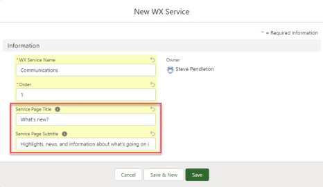
New fields on the WX Service page layout
We've added new fields to the New/Edit WX Service page. This provides titles and subtitles for the new sections of the homepage and service pages.
These fields provide a title and subtitle that appear above the carousel component:
-
Service Page Title: the main heading for the service page. If empty, the system uses the service name
-
Service Page Subtitle: a brief subtitle that appears under the page title. Leave empty for none
These fields provide a title and subtitle that appear above the community summaries section:
-
Community Section Title: a heading for the community updates section that displays summary processes. If empty, the system uses the default label "Community updates"
-
Community Section Subtitle: a brief subtitle that appears under the community updates section title. Leave empty for none
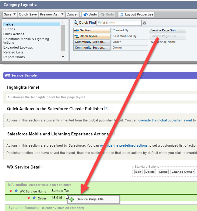
Before you can use the new fields to control the labels for the new homepage, add these to your WX Service creation page layout.
-
Go to Setup , and select the WX Service object.
-
Select Page Layouts.
-
Select the page layout you use for your WX services.
-
Select the Service Page Title field from the panel at the top of the page. Drag it to the WX Service Detail section.
-
Repeat the process to add the additional fields as you require:
-
Service Page Subtitle
-
Community Section Title
-
Community Section Subtitle
-
-
Select Save.
For more information about updating page layouts, see Page layouts, search layouts, related lists.