Page layouts control the layout and organization of fields, buttons, related lists, custom links, and Visualforce pages in Sage People. They also help determine which fields are visible, read only, and required.
Page layouts can include s-controls and Visualforce pages rendered within a field section when the page displays. You can control the size of the s-controls and Visualforce pages, and determine if a label and scroll bars display.
You can't edit fields on pages using Visualforce overlays, such as the Team Member page, in-line in the Salesforce Lightning Experience. To edit in-line, switch to the Salesforce Classic interface. Or see if the field is available for editing in a Salesforce Lightning Experience list view.
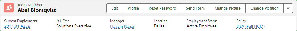
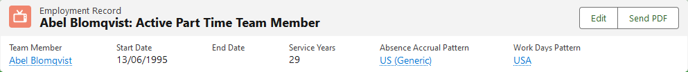
Compact layouts display a record's key fields in Salesforce Lightning Experience. If we created your org after April 2022, we configured some frequently-used record pages as Lightning record pages. You can see a compact layout as the highlight panel header section of team member and employment record pages:
Search layouts control the layout of a particular type of page. Those containing the results the system returns by different kinds of searches, including:
-
Search results
-
Search filter fields
-
Lookup dialogs
-
Recent records lists displayed on the tab Home pages
You can control search layouts using the search layout editor for each search results page.
The Page Layouts of particular interest to Sage People HR Administrators are:
-
Team Member
-
Employment
-
Benefit
You can go to the page layout editor in several ways:
-
Select Setup, then select Edit Object, from the sidebar select Page Layouts
-
From the list of objects:
-
In Salesforce Lightning Experience, go to Setup then select Object Manager. Select the object label and from the sidebar, and click Page Layouts
-
Select Edit next to the page layout you want to change.
If the page you want to edit is a Lightning record page, you can edit it in the Lightning App Builder. When you're on the page, select Setup, and then select Edit Page. You have access to Lightning page components, and you can add fields to the page using the Field Section component. You can't edit Field Sections in the page layout editor. You need to use the Lightning App Builder. For more information, refer to Salesforce help content on Lightning record pages.
If we created your org after April 2022, we configured some frequently used record pages as Lightning record pages.
Using the Page Layout editor
Add or remove items
-
Fields, buttons, custom links, related lists, Visualforce Pages:
-
To add:
Drag and drop from the display of available components onto the sample page layout
Use CTRL+select to select multiple items individually. Or SHIFT+select to select multiple items as a group
-
To remove:
Drag and drop from the sample page layout onto the display of available components to remove
-
-
Sections
-
To add:
Select Fields or Visualforce Pages. Then drag and drop the Section marker to create the new section on the sample page

Sage People displays the Section Properties dialog

You can set:
-
The section name, as it displays on the page
-
Where the section name displays: on Detail or Edit pages, or both
-
The number of columns the system uses to display the section: one column or two columns
-
Where the section includes two columns, the tab-key order to use
Set the values you want to use and select OK.
-
-
To remove:
Go to the section you want to remove and select Remove

-
Move items within a page
-
Fields, buttons, custom links, related lists, Visualforce Pages:
In the sample layout, drag and drop to the position you want.
Change the properties of an item
-
Field
In the sample layout, select the field and choose Properties


Sage People displays the Field Properties dialog

You can also select multiple fields using CTRL+ select. Selecting Properties then displays a combined Field Properties dialog for all selected fields.
-
You can't change the field properties of some standard fields. You can only change custom fields if they aren't universally required fields. We mark fields you can't change with a closed padlock icon

-
Fields the system marks as read only are editable by administrators and users with Edit Read Only Fields permission
-
If you make a picklist field read only, all new records contain the default value for that picklist
-
Auto-number fields are always read-only
-
Read-only fields display on the associated Detail page layout, not the Edit page layout
-
In Salesforce Enterprise, Unlimited, and Developer Editions, field level security settings override any field properties you set here. this is if the field level security is more restrictive than the page layout setting
-
-
Section
In the sample layout, go to the section you want to change and select Properties

Sage People displays the Section Properties dialog

You can change:
-
The section name, as it displays on the page
-
Where the section name displays: on Detail or Edit pages, or both
-
The number of columns the system uses to display the section: one column or two columns
-
Where the section includes two columns, the dialog includes a tab-key order selector

Select the order you want to use on this page.
-
-
Related List
Double-click the related list in the Related List Section, or select the Properties
icon
To select or deselect fields the system displays as columns in the related list, in Columns:
-
Select one or more fields and select Add
 or Remove
  . You can include up to 10 fields in a related list
 -
Sort fields by selecting them and choosing Up
 to move a column left or Down
  to move a column right
 -
Use CTRL+select to select multiple fields individually
-
Use SHIFT+select to select multiple fields as a group
-
Select a field from Sort By to sort the items in the related list. Sort items in Ascending or Descending order using the radio buttons. The default sort order varies per record. Sort By isn't available for activities and opportunity products
-
If necessary, select other page layouts to host related list customizations
To select or deselect which buttons display in the related list, in Buttons:
-
Select the checkbox next to any Standard button name to customize which standard buttons display in the related list
-
Select any Custom button listed and choose Add
or Remove -
Sort custom buttons by selecting them and choosing Up
or Down
Some related lists aren't customizable because they link to data rather than store it. Move your cursor over any related list section to see if it's customizable. Also, lookup fields aren't available for display on their corresponding lookup-related list.
Select the Overwrite users’ personal related list customization to apply the related lists in the page layout to all users. Do this even if they've already customized their display.
-
Preview and save
-
Select Preview As... to review the page layout. Select a profile to see how the pages will look for users with different profiles.
NoteMost related list columns preview without data.
-
Select Save to finish. Alternatively, select Quick Save to save and continue editing the page layout.