To complete the report, let's add a chart component to display the rate analysis.
-
In the report builder, select Add Chart in the top right.
-
Select the gear icon to change to a different component type and set the column used for the metric.
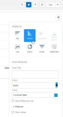
Column or Bar charts usually work best for this type of report.
-
Set the X-Axis to your grouping: Basis.
-
Set the Y-Axis to your Turnover Rate calculated field.
-
Optionally set a Reference Line value that shows your ideal turnover limit.
-
-
Select Save.
Congratulations! You’ve created a joined report that uses a formula to calculate a percentage value from 3 different report blocks. Now that you know how it’s done, you can change the configuration of this report, such as adjusting the date range, grouping, and columns, or you can use your knowledge to experiment with creating different types of reports and calculations.